New toy: Whidbey #.NET
Since I've got a laptop that will be re-Ghosted when I get back to the office, it seemed like a perfect time to try out some beta software without screwing up a production machine. So I've been playing around with Visual C# Express.
Part of the agreement, to download it, was that I wouldn't use it to write production apps, that I would only use it for testing and to report feedback to Microsoft. That's okay as far as it goes, but they don't ever actually tell me how to report feedback. They should take a cue from shareware apps, and have a "Help > Submit Feedback" menu item. Ah well. This blog post can be my feedback.
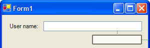
Whidbey has some new UI components, and some of them look pretty crappy. Their new status bar has some potential; each panel is a separate control that you can click on to select in the designer, which is cool, and there are plenty of properties that look like they might be interesting if they were actually documented and/or comprehensible. (MergeIndex? Overflow? ImageKey?) You can even put a progress bar into the status bar. The big downside is that each panel draws a border around itself. Which would be fine if the panels were as tall as the status bar. But they're not.
![]()
Pretty bad, huh? If they just fixed that three-pixel gap between the bottom of each status panel and the bottom of the actual status bar, it'd be great.
I tried to improve it by getting rid of the border around each panel, but they don't let you do this. There are two properties that control the border. The possible values for BorderSides are Left, Top, Right, Bottom, Middle, and All (the default); conspicuously absent is anything resembling None. And the possible values for BorderStyle are RaisedOuter, SunkenOuter, RaisedInner, Raised, Etched, SunkenInner, Bump, Sunken, Adjust, and Flat (the default); again, nothing resembling None. (Nor any sane order to the values. I wonder if they designed that enum right after a prolonged game of Call of Cthulhu.)
Now, if this were Delphi, you know there'd be a way to turn the damned border off.
They've also (sigh) put in-place editing into the designer, so now you can't just click on a control to select it. Because if you do, and it was already selected, then it will start in-place editing. Which raises the question of how you're supposed to get focus back onto the design surface without changing your current selection, since clicking on your current selection is now broken. You're supposed to click and then hit Esc, apparently. Clumsy. Takes me right back to the days of the Access form designer. Ugh.
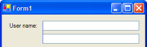
The MainMenu component is gone; in its place is the MenuStrip, which has a sort-of-not-quite Office 2003 look-and-feel. Kind of nice. The hover rectangle over the top-level menu items is about a pixel too small in all directions except the right, where it might be a pixel too large. And inside the dropdown menu, that left-side gutter really needs work.

Note how the hover rectangle actually overlaps the image. Jordan wouldn't be caught dead shipping code with that kind of glitchiness.
The toolstrip looks much nicer than the old toolbar. (A photo of a garbage scow would look much nicer than the old WinXP toolbar.) The only gripe I have here is that it paints a grip down the left side, but you can't undock it. Why have a grip if you can't drag the thing anywhere? I wonder if they're planning to add docking later. (And I mean "dock" in the traditional sense of docking toolbars like in Office, not the "we really mean Align but we're going to be stupid and call it Dock just so we don't look like we ripped too much off from Delphi" sense that WinForms usually prefers.)
There's an intriguing couple of controls called the FlowLayoutPanel and the TableLayoutPanel. The flow layout really caught my attention, since I didn't think real flow layout was going to happen until Avalon. It turns out I was right. You can't drop a label on there and give it a paragraph of text and have it word-wrap, more's the pity. Which leads me to wonder what, exactly, the FlowLayoutPanel's point is supposed to be. They align on tops rather than baselines, which means you need to do some work even to do something as simple as embedding a text box in the middle of a paragraph and make it look right. But it's interesting nonetheless.
TableLayoutPanel has possibilities, e.g. for a data-input form; you can have the labels all in one column of the grid, and the text boxes all in the second column. Nice, once you get over its quirkiness. Notes: You can only drag-resize the rows and columns if the panel is not yet the selected control. If you do the data-entry thing, you want to set all the RowStyles to SizeType=AutoSize, and the first (label) column should also be AutoSize. What's really cool is how they use anchors: drop text boxes in the right column, and they'll center themselves in the cells and look kinda puny, but as soon as you turn on the left and right anchors, boom! they fill the available width. Cool!
So that's all that stuff. But actually, the first thing I noticed, when I looked at VC#Express, wasn't any of the new controls, or anything else that was new. I noticed what wasn't there. The sizing grid. You know, those black dots every 8 pixels horizontally and vertically? Gone.
At first I assumed it just wasn't painting correctly for whatever reason (it is a beta), but then I tried resizing a control, and whoo. All over the place. So I went into Tools > Options.
Advice: when you go into Tools > Options, the first thing you must do is check the "Show all settings" box. Without that, some vitally important settings (like the "where the hell is the designer grid?" setting) are just missing. And it's not just that some pages aren't listed in the treeview — it looks like it hides some of the controls on the pages, too.
I finally turned on "Show all settings" and found the "where the hell is the designer grid?" setting. And it was set to "Well, what are you asking me for? The grid is enabled."
After a period of hot pursuit of undomesticated fowl through the docs (can you say sketchy?), I finally found out that the default isn't grid mode, it's something new called SnapLines. And after more wild goose chase (followed by giving up on the docs and actually trying it), I found out what the hell that actually means. Sam, you'll recognize this right away, because you've already shown it to me.
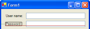
When you're dragging a control around, it snaps to a certain distance away from the edge of the form, or to a (different) certain distance away from the nearest control. When you're resizing a control, they'll snap its size to match up with other controls on the form. Yes, they even know how to align the baseline of your label to the baseline of the text in your text box. (And yes, it's a pretty direct rip-off of the Mac designer. But one I was hoping MS would do ever since Sam showed me the Mac designer.) Very cool. It's still buggy, but whee, this is gonna be a fun feature to play with!
Alas, snapping a text box to the right edge of the form doesn't automatically turn on the text box's right anchor. They may get to that, though.
Hmm. I really wonder just how they do that baseline thing. And here I am, writing this in my hotel room, with no Internet access, and I forgot to download Reflector before I headed to BorCon. Sigh.